
Better images for mind maps
A criterion for choosing images that increase reading productivity
One of the steps in creating a mind map is illustration. Well, it may be, because we don't always decide to illustrate, we don't always have the images we need, we don’t always have the ability or know how to produce them, we don't always have time to illustrate.
In illustrations, an image has a degree of quality. The aspect related to image quality that we are going to talk about here is the readability of an image. Using this word for images may sound strange, but we will show here that certain images are more appropriate for mind maps, because they impact reading productivity.
The criterion
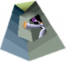
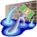
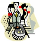
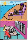
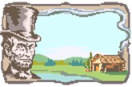
Look at the images below, one at a time:
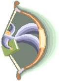
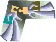
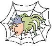
Now look at these, in the same way:


What is a fundamental difference between the two groups related to the speed of understanding the image, that is, the acquisition of its meaning? Go back to the first group and try to answer the question:
"How many glances do I have to give the image to fully understand it?"
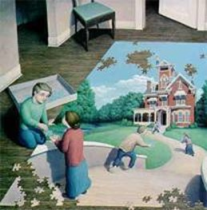
Maybe you even went through the second set more quickly. Although we will not theorize about image perception here, the practical fact is that certain images can be recognized and interpreted at first glance, and others require two or more. Note that "first glance" images are simpler in the number of elements and more clearly defined, while lower productivity images can have several elements, diffuse colors, and are sometimes structured, having different levels (like something inside something else) or scenarios, such as the last one in group 1.
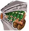
A particularly interesting case is the structured image but with visual patterns, such as the one below. We soon notice that there is something repeated in it, which helps to assemble understanding.

As additional references to support what we have said - somewhat exaggerated, we admit, but take this as a didactic example - look at the images below and try to notice how many glances you need to give to understand them minimally.
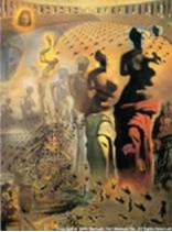
(If you couldn't fully understand the one on the left, don't be surprised, it's in the category of visual ambiguities. The second is a painting by Salvador Dali. Images from the website www.Possibilidades.com.br).
Clarifying glances
If the concept of multiple glances is still somewhat abstract for you, a few simple experiments will better support this idea.
Look around you for something yellow (if you can't find it, choose another color). As you do so, try to notice how you do it: essentially, you scan the room looking for the color; when you finally find it, you stabilize your gaze and attention on the object or part of the object that has the color sought. This moment of stabilization is what characterizes a glance.
Now look for a green-colored object that has something written on it. You will again look for the color; when you find it, you stabilize the focus of your attention on the object and then see if anything is written on it; when you find it, you stabilize again on the writing. In this case you had to take at least two glances to get the targeted result.
Small, well-defined, detailed images allow you to process them—recognize and interpret them with just the first glance, possibly even using your peripheral vision.
Image readability
Considering that, due to space limitations, we tend to put reduced images in mind maps, it is critical for good reading and comprehension productivity to insert simple and direct images that preserve these characteristics when in small size. We will refer to these images as more or less readable.
Do a test of these statements: look at the figures below, purposely small, and see which ones you find most easily readable:


Note that these are images that you have already seen in larger size, which should make it easier for you to read, but it probably happened to you that it still took longer for some.
Now do the same readability test with new images:


The guideline
As we, mind mappers, are enthusiasts and seekers of synthesis, there is nothing better than seeking to synthesize the ideas above. The overview takes the form of a guideline:
When illustrating a mind map, look for more readable images.
Note that we didn't say "use" but "look for images", and we also didn't say "look for readable images" but "more readable". There is a foundation for this: finding the ideal image is not always easy; we try to be realistic, the fact that we seek does not mean that we will find. There will be times when we have to make do with what we have – if we have anything at all. But having a good criterion for image selection can increase the productivity of the illustration stage because we will have a filter to quickly eliminate many possibilities. And if you produce your own images, you'll also see your productivity increased because you'll tend to make simpler – but still meaningful – images when you apply this criterion.
Another possible visual representation of the guideline follows below. The images symbolize that a glance implies greater reading productivity. By the way, the eye was taken from a photo of Gisèle Bundchen. Just, of course, as a mnemonic resource.


Cautions and exceptions
Flexibility
It may be good to remember that criteria and guidelines are not laws, and no one is obliged to apply them. There will be situations where it may be better to insert an image that is impressive or in some cases a more complex image may be the best option.
For example, in a descriptive mind map of books, in which the main illustrations are the covers of the books, inserting thumbnails of the covers will be a good choice.
In general, the desired effect/outcome will be the main reference, and feedback from experience will provide the best support for the choices you make.
The first time is different
You have certainly walked in the dark; how is that possible? What capacity do we have to have to be able to walk without up-to-date information on the environment? The answer is that we use memories, images retrieved from previous perceptions of that place. If things continue to be as we remember, being guided by them will be easy; when there are new things in the way, we stumble.
Something similar occurs when we read an image. If we remember it accurately, we don't even need to look at it. If some detail is missing, we look enough to complete the mental replica of the image. Thus, the fact that an image is structured implies that the first time we will have to give it more glances, but the next time this may not be necessary.